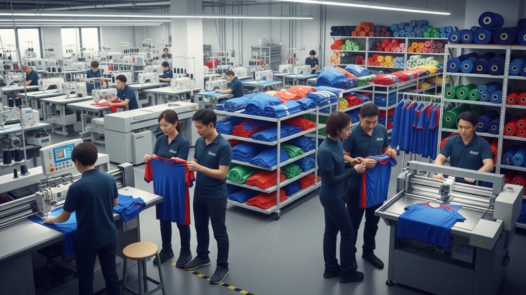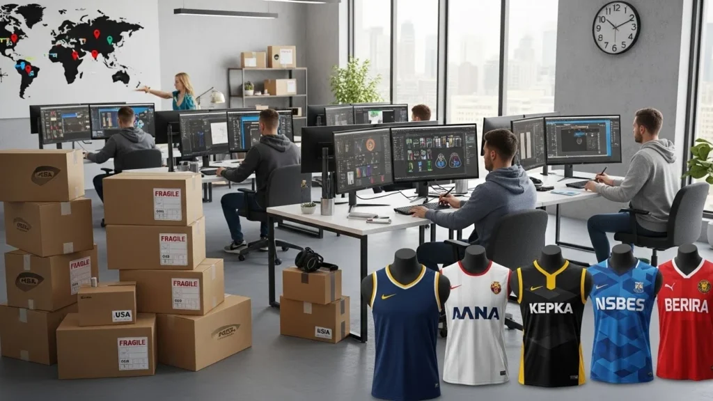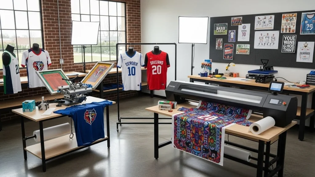
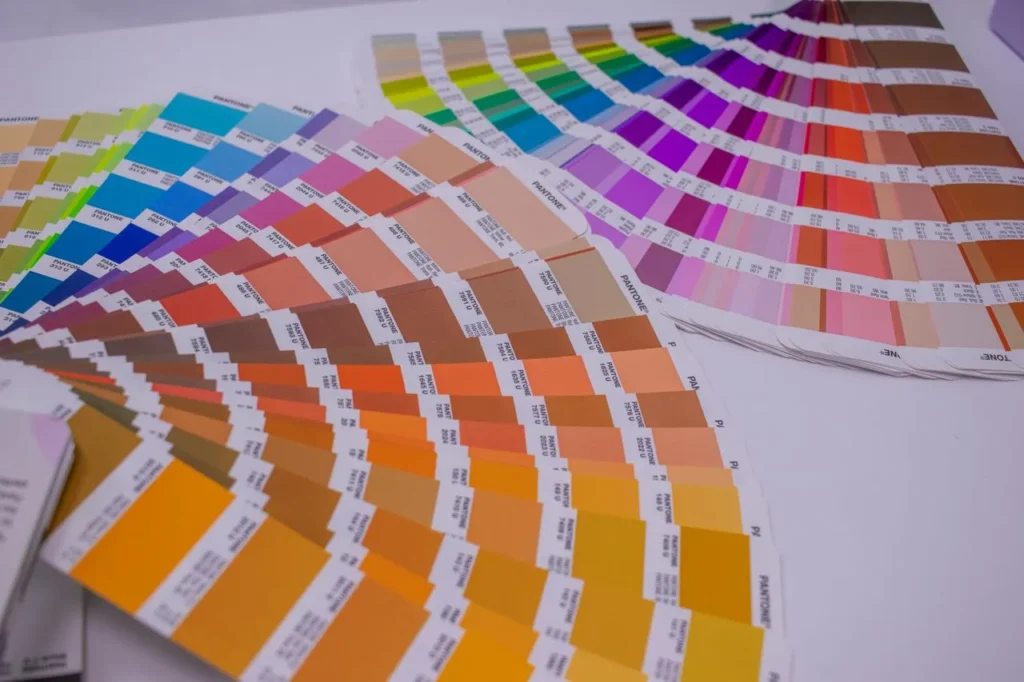
Pantone color matching is one of the most important steps in custom sportswear manufacturing. A jersey may have the right fabric, correct stitching, and perfect fit, but if the team color looks wrong, the whole product feels unapproved. Color is emotional. It carries brand identity, club history, sponsor visibility, and customer trust.
In sportswear, color is also difficult to control. The same red can look different on polyester interlock, mesh panels, rib fabric, embroidery thread, silicone badges, heat transfers, woven labels, and packaging. A shade that looks strong on a digital mockup may appear dull after sublimation. A navy blue approved on screen may look too purple under factory lighting. A bright yellow may change after washing, heat pressing, or moving from paper artwork to fabric.
This is why Pantone color matching should never be treated as a small design detail. It is a production-control process. It helps brands, designers, manufacturers, printing teams, dyeing units, embroidery teams, and quality inspectors speak the same color language before bulk production begins.
For B2B buyers working with an OEM sportswear manufacturer, Pantone color matching can reduce sampling confusion, protect brand consistency, and make repeat orders easier to control.
What Is Pantone Color Matching?
Pantone color matching is the process of using a Pantone color reference to guide fabric dyeing, sublimation printing, screen printing, embroidery, trims, badges, labels, and packaging.
Pantone is widely used because it gives designers and manufacturers a shared color reference. Instead of saying “dark green” or “bright red,” a buyer can provide a specific Pantone code. This makes communication clearer, especially when the buyer, designer, and manufacturer are working in different countries.
However, Pantone color matching does not mean that every material will look exactly identical. A Pantone code is a reference point, not a magic guarantee. Sportswear materials absorb, reflect, print, and display color differently.
A good manufacturer uses Pantone as the starting standard, then confirms the result through physical swatches, lab dips, print strike-offs, decoration samples, wash tests, and final pre-production approval.
“A Pantone code gives the color direction, but the approved physical sample becomes the real production standard.” — BUSHI Sports®
Why Pantone Color Matching Matters in Sportswear
Color consistency matters more in sportswear than many buyers realize. Team uniforms must look identical across players. Retail activewear collections need matching tops, leggings, sports bras, jackets, and accessories. Private-label brands must keep signature colors stable across repeat production.
A small shade difference may not look serious on one garment. But when 200 team jerseys are placed together, the problem becomes visible. If the shorts are slightly darker than the jersey, the kit looks mismatched. If the sponsor logo color shifts, brand presentation suffers.
Pantone color matching helps control:
- Team colors
- Brand signature shades
- Sponsor logos
- Sublimated graphics
- Embroidery threads
- Patches and badges
- Heat-transfer artwork
- Rib, collar, and cuff matching
- Zippers, drawcords, and trims
- Labels, tags, and packaging
For a sports uniform manufacturer, color control is part of the product’s identity. A football club, volleyball team, academy, or school does not only want a jersey. They want their exact colors represented correctly.
Pantone TCX, TPG, and PMS: Which One Is Used for Sportswear?
One common mistake is using the wrong Pantone system. Not every Pantone reference is made for the same surface.
The Pantone textile color system is designed for fashion, textiles, and soft goods. Pantone TCX is commonly used for textile and apparel references. Pantone also explains that TCX references textiles, while TPG references pigments and coatings.
For sportswear manufacturing, TCX is often more relevant when discussing fabric color. TPG may be useful for coated surfaces, trims, accessories, packaging, or non-fabric components. PMS, also known as the Pantone Matching System, is widely used in graphics, packaging, and print communication.
Here is the simple way to understand it:
| Pantone system | Best use | Sportswear example |
|---|---|---|
| Pantone TCX | Textile and apparel color references | Dyed fabric, rib, cotton-based references |
| Pantone TPG | Pigments, coatings and hard surfaces | Trims, accessories, coated materials |
| Pantone PMS | Graphic and print communication | Logos, packaging, print artwork |
| Physical swatch | Final production approval | Approved fabric, strike-off, badge or trim |
If a buyer sends only a PMS code for a fabric color, the manufacturer may still use it as a direction, but the final approval should be confirmed through an actual fabric swatch or lab dip.
Where Pantone Color Matching Is Used in Sportswear Manufacturing
Pantone color matching can be used in almost every stage of custom sportswear production. It is not limited to fabric dyeing.
1. Fabric dyeing
Dyed fabrics such as fleece, cotton blends, interlock, rib, or woven materials may require lab dips. A lab dip is a small dyed fabric sample prepared to match the requested shade.
The buyer reviews the lab dip under controlled lighting and approves the closest version before bulk fabric dyeing begins.
2. Sublimation printing
Sublimation is common in custom teamwear because it allows full-color designs, names, numbers, sponsor logos, gradients, and patterns. But sublimation color can shift after heat transfer because ink, paper, temperature, pressure, time, and fabric base all affect the final shade.
This is why sublimation designs should be approved through a fabric print strike-off, not only a digital mockup. BUSHI Sports® has also explained the production difference between sublimation and cut-and-sew manufacturing, which is important when color and panel alignment are both critical.
3. Screen printing and heat transfer
Screen printing and heat transfer need color approval for ink, vinyl, film, adhesive, and fabric compatibility. A color may appear sharp on white fabric but less accurate on dark or textured fabric.
Brands comparing these methods can review the BUSHI Sports® guide on screen printing vs heat transfer before selecting a decoration method.
4. Embroidery
Embroidery thread colors do not always match Pantone colors exactly. Thread brands use their own shade cards, and the final appearance changes with thread shine, stitch direction, fabric texture, and lighting.
For logos, crests, and badges, the closest thread shade should be approved physically. The BUSHI Sports® comparison of sublimation vs embroidery explains how the decoration method affects appearance, weight, durability, and fabric performance.
5. Patches, badges, and trims
Pantone color matching is also useful for woven patches, silicone badges, zipper pulls, drawcord tips, labels, elastic, and packaging. But each material behaves differently.
A silicone badge may look more matte or glossy than a woven patch. A woven patch depends on yarn shade and weave direction. A heat-applied badge may be affected by fabric color and heat settings.
The BUSHI Sports® guide on silicone badges vs woven patches is useful when brands need durable sportswear branding with controlled color.
Digital Color vs Physical Color
A digital mockup is helpful, but it should never be the only color approval standard. Screens are not reliable for final sportswear color approval because every device displays color differently. Brightness, contrast, screen calibration, viewing angle, and surrounding light all change perception.
A color that looks perfect on a laptop may not match the same color on fabric. This is especially true for neon shades, deep navy, bright red, fluorescent green, orange, yellow, and dark grey.
Pantone color matching works best when digital artwork is followed by physical approval steps:
- Pantone reference
- Artwork file
- Fabric or material selection
- Lab dip or print strike-off
- Decoration sample
- Pre-production sample
- Bulk production approval
This process may feel slower, but it prevents expensive mistakes. In bulk production, correcting color after fabric has been printed, dyed, cut, or stitched is much harder than approving it correctly at sample stage.
Pantone Color Matching Process for Custom Sportswear
A professional Pantone color matching process should be simple, documented, and repeatable.
Step 1: Define the color standard
The buyer should provide the Pantone code, brand guideline, previous approved sample, or physical color swatch.
For brand-critical colors, a physical reference is best. If a club or brand has used the same red, blue, green, or gold for years, the previous approved garment can help guide the new production.
Step 2: Confirm the material
Color must be approved on the actual material whenever possible. Polyester mesh, brushed fleece, rib, cotton jersey, compression fabric, and woven fabric do not show color in the same way.
A custom activewear manufacturer should check color on the same fabric quality that will be used in production.
Step 3: Prepare lab dips or print strike-offs
For dyed fabrics, lab dips are prepared. For sublimation, print strike-offs are produced on the actual fabric. For embroidery, thread samples are selected. For patches or badges, a decoration sample is made.
Step 4: Review under proper lighting
Color should be reviewed under consistent light. Daylight, warm indoor light, cool LED, and factory lighting can make the same sample look different.
This is why brands should avoid approving color only from phone photos or social media images.
Step 5: Record the approved sample
The approved color sample should be labeled and stored. The record should include Pantone code, material, supplier reference, approval date, revision number, and product style.
This record helps during repeat orders.
Step 6: Compare bulk production against the approved standard
Bulk fabric, printed panels, trims, labels, and finished garments should be compared against the approved sample before shipment.
BUSHI Sports® includes sample review and quality checks as part of its sportswear manufacturing services, helping brands control fabric, construction, customization, labels, packing, and final production quality.
Common Pantone Color Matching Problems
Color problems are common when the approval process is too casual.
The most frequent issues include:
- Approving color only from a screen
- Using PMS for fabric without physical confirmation
- Not checking color on the final fabric
- Ignoring stretch, texture, and GSM
- Not approving sublimation strike-offs
- Choosing embroidery thread without a thread chart
- Forgetting trims, labels, zippers, and rib matching
- Not checking color after washing
- Not storing approved swatches
- Mixing old and new production lots without comparison
A small shade difference may happen because textiles are not printed like paper. Fabric absorbs dye and ink differently. Texture changes reflection. Stretch can lighten the appearance. Heat can affect transfers. Stitch direction can change how embroidery reflects light.
The goal of Pantone color matching is not to pretend that all materials behave the same. The goal is to control the differences before they become a bulk-production problem.
Pantone Color Matching for Sublimated Sportswear
Sublimated sportswear needs special attention because the design is transferred from paper to polyester fabric using heat and pressure.
The final color depends on:
- Fabric composition
- Fabric GSM
- Fabric whiteness
- Ink quality
- Paper quality
- Heat temperature
- Pressing time
- Pressure
- Moisture in fabric
- Artwork profile
- Machine calibration
For custom jerseys, sublimation is often used for team colors, sponsor logos, player names, numbers, gradients, and full-body graphics. This makes color approval even more important.
A buyer should not approve a sublimated uniform only from a mockup. The correct method is to approve a printed fabric strike-off or full pre-production sample.
The BUSHI Sports® sportswear sample approval checklist is useful here because it reminds buyers to inspect color references, print quality, logo placement, measurements, stitching, labels, and packaging before bulk approval.
Pantone Color Matching for Embroidery and Patches
Embroidery and patches require a slightly different approach. Pantone can guide the shade, but thread and yarn matching is not always exact.
Embroidery thread has shine. Woven patches have yarn texture. Silicone badges may have matte, gloss, or raised surfaces. These surface differences change how the color appears.
For example, a royal blue sublimated panel and a royal blue embroidered crest may not look identical even if both are based on the same Pantone reference. The best approach is to approve all decoration components physically and view them on the garment fabric.
If a buyer is deciding between badge types, BUSHI Sports® has published detailed guides on direct embroidery vs embroidered patches and silicone badges vs woven patches. These comparisons help buyers understand color, texture, weight, durability, and attachment differences.
Color Tolerance and Delta E
In professional color control, manufacturers may use Delta E to measure the difference between a target color and a sample color. Delta E gives a numerical way to discuss how close or far two colors are.
The X-Rite color quality guidance explains that Delta E measures color differences between a target and a sample. Datacolor also explains that color tolerance depends on the product, application, and business requirement.
This matters because not every sportswear color needs the same tolerance. A brand’s signature color may need a tighter tolerance than an internal care label. A team jersey front panel may need stricter control than a hidden seam tape.
A practical sportswear color tolerance plan may divide items like this:
| Item | Color importance | Approval method |
| Main team color | Very high | Pantone reference plus fabric strike-off |
| Sponsor logo | Very high | Artwork proof and print sample |
| Embroidered crest | High | Thread chart and embroidery sample |
| Rib, collar and cuff | High | Physical trim match |
| Zipper or drawcord | Medium | Closest available trim shade |
| Care label | Low to medium | Standard label approval |
| Packaging | Medium | PMS or print proof |
This table shows why Pantone color matching must be practical. Some parts need strict matching. Others need an acceptable closest commercial match.
Testing Color Before Bulk Production
Color should be checked before and after basic testing. A shade that looks correct before washing but fades, bleeds, or transfers after use is not ready for approval.
Relevant checks may include:
- Wash appearance
- Color change
- Color staining
- Rubbing or crocking
- Heat-transfer resistance
- Sublimation migration
- Perspiration resistance
- Light exposure, where required
- Shade matching between fabric lots
- Shade matching between garment parts
The AATCC TM61 laundering test is used to evaluate colorfastness to laundering for textiles expected to withstand frequent washing. The ISO 105-X12 rubbing test evaluates resistance to color rubbing off and staining other materials.
Sportswear is washed often. It is exposed to sweat, friction, heat, and repeated movement. For this reason, color approval should consider both appearance and durability.
Pantone Color Matching in a Sportswear Tech Pack
A sportswear tech pack should include color instructions clearly. Writing “blue” or “same as mockup” is not enough.
The color section should include:
- Pantone code
- Fabric color reference
- Contrast color references
- Thread color reference
- Print color reference
- Badge or patch color reference
- Trim color reference
- Label and packaging color reference
- Approved lab dip or strike-off
- Color tolerance, if required
- Lighting or viewing notes
- Revision history
A good tech pack prevents confusion between design approval and production approval. If the Pantone code changes, the tech pack should be updated. If the second sample is approved instead of the first, that approval should be recorded clearly.
Sportswear construction details should also be included in the same file. The BUSHI Sports® article on sportswear stitching types explains how seams, stitch type, thread, and construction affect performance apparel quality.
Product-Specific Color Matching Notes
Team uniforms
Team uniforms need strong color control because multiple players wear the same kit together. Jerseys, shorts, collars, cuffs, sponsor marks, numbers, and socks should look coordinated.
For custom teamwear, Pantone color matching should be checked on the full uniform set, not only the jersey front.
Activewear
Activewear collections often use multiple products in one color story. A sports bra, legging, tank top, and jacket may use different fabrics. Even if the color code is the same, each material may reflect light differently.
This is why private-label activewear brands should approve color by product and material.
Sports gloves
Sports gloves include palms, backs, padding, grip zones, elastic, closures, trims, and logos. Each component may require its own color approval.
For brands working with a custom sports gloves manufacturer, Pantone color matching should be checked across leather-like materials, mesh, printed panels, labels, and closure systems.
Tracksuits and outerwear
Tracksuits may combine shell fabric, rib, zippers, drawcords, lining, embroidery, patches, and heat transfers. A slight mismatch between jacket and trouser fabric can be visible when worn as a set.
Color approval should therefore cover the full garment, not only the main fabric.
Pantone Color Matching Checklist for Buyers
Before approving a custom sportswear sample, buyers should check:
- Is the correct Pantone system used?
- Has the shade been checked on actual fabric?
- Is there a lab dip or print strike-off?
- Has the logo color been approved physically?
- Do trims, rib, zippers, and drawcords match acceptably?
- Has color been checked under consistent light?
- Are photos only used for reference, not final approval?
- Has the sample been washed?
- Is the approved swatch labeled and stored?
- Is the color standard written in the tech pack?
- Are bulk materials checked against the approved standard?
This checklist is especially important for brands ordering custom uniforms, activewear sets, sports bras, leggings, tracksuits, gloves, and private-label sportswear collections.
How BUSHI Sports® Handles Color Matching
BUSHI Sports® supports custom sportswear, private-label sportswear, activewear, teamwear, sports uniforms, sports gloves, casual wear, outerwear, and equestrian gear for international B2B buyers.
As a global custom sportswear manufacturer, BUSHI Sports® uses color references, fabric swatches, mockups, samples, printing approvals, embroidery approvals, trims, and final quality checks to help buyers control color before bulk production.
Pantone color matching can be used during:
- Product development
- Fabric sourcing
- Sublimation artwork approval
- Embroidery and badge approval
- Tech pack review
- Physical sample development
- Pre-production approval
- Bulk production inspection
- Repeat-order comparison
The company works with sports brands, private-label clothing brands, teamwear companies, clubs, gyms, retailers, wholesalers, distributors, schools, academies, equestrian brands, importers, and sourcing companies.
For buyers, the best approach is simple: share the Pantone code, reference sample, artwork file, product type, fabric preference, quantity, branding method, and required delivery plan before sampling begins.
Frequently Asked Questions
What is Pantone color matching in sportswear?
Pantone color matching in sportswear is the process of using Pantone color references to guide fabric dyeing, sublimation printing, embroidery, trims, badges, labels, and packaging so the final product matches the approved color direction as closely as possible.
Is a Pantone code enough for sportswear manufacturing?
No. A Pantone code is helpful, but it should be confirmed through physical fabric swatches, lab dips, print strike-offs, embroidery samples, or trim samples. Fabric and decoration methods can change how a color appears.
Which Pantone system is best for sportswear fabric?
Pantone TCX is commonly used for textile and apparel references. However, final approval should still be based on the actual fabric or approved swatch.
Why does sublimation color look different from the mockup?
Sublimation color can change because of fabric type, fabric whiteness, ink, paper, temperature, pressure, time, and artwork settings. A printed fabric strike-off is more reliable than a digital mockup.
Can embroidery thread exactly match Pantone?
Sometimes it can be close, but exact matching is not always possible. Thread brands have their own shade cards, and shine or stitch direction can change the appearance. A physical embroidery sample should be approved.
What is Delta E in color matching?
Delta E is a numerical measurement of color difference between a target and a sample. Lower Delta E means the colors are closer. The acceptable tolerance depends on the product, color importance, and buyer requirement.
Should trims match the main fabric exactly?
Not always. Zippers, drawcords, elastic, rib, and labels may have commercial shade limitations. The goal is to approve an acceptable match before production.
How can buyers avoid color mistakes?
Buyers should provide Pantone codes, approve physical samples, check color under consistent lighting, test washing where required, store approved swatches, and document color details in the tech pack.
Conclusion
Pantone color matching is a practical quality-control step in sportswear manufacturing. It helps brands communicate color clearly, but it must be supported by physical samples, material testing, and written approval.
A Pantone code alone cannot account for fabric texture, sublimation behavior, embroidery shine, trim materials, lighting, washing, or bulk production variation. The strongest process combines Pantone references with lab dips, strike-offs, decoration samples, tech pack documentation, and pre-production approval.
For custom sportswear, teamwear, activewear, sports uniforms, gloves, tracksuits, leggings, sports bras, outerwear, and private-label collections, color approval should happen before bulk production begins.
BUSHI Sports® helps B2B buyers develop custom sportswear with fabric selection, mockups, samples, Pantone color matching support, sublimation, embroidery, branding, stitching, quality inspection, packaging, and worldwide delivery.
To discuss your next order, contact BUSHI Sports® through the contact page, send details by WhatsApp, or email info@bushisports.com.
You can also view BUSHI Sports® on Google Maps or connect through LinkedIn.