Color matching in sportswear printing is one of the most critical elements of custom apparel production, yet it is often underestimated by brands placing bulk orders. From team jerseys and training kits to private-label activewear, accurate color reproduction directly affects brand identity, professionalism, and customer trust. Even a slight color inconsistency can make uniforms look mismatched, distort sponsor logos, or reduce the perceived quality of the final product.
As sportswear manufacturing becomes more global and competitive, brands must understand how different color systems work. The two most widely used systems in sportswear printing are Pantone and CMYK. Each serves a specific purpose, and choosing the right one can significantly improve production outcomes. This guide explains color matching in sportswear printing, compares Pantone vs CMYK in depth, and helps brands make informed decisions when working with manufacturers like Bushi Sports.
Why Color Matching in Sportswear Printing Matters
In sportswear, color is more than a visual detail—it is a core branding element. Teams, clubs, and sponsors rely on precise colors to maintain recognition across different competitions, seasons, and markets. Inconsistent colors can weaken brand identity and make apparel appear unprofessional.
Accurate color matching in sportswear printing is essential because it impacts:
-
Team and brand consistency
-
Sponsor logo accuracy
-
Visual appeal on the field and on camera
-
Customer satisfaction and repeat orders
-
Long-term reordering reliability
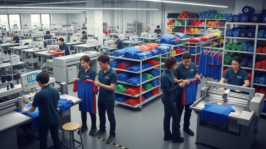
For bulk sportswear production, color issues scale quickly. A small mismatch on one jersey becomes a major issue when repeated across hundreds or thousands of garments. This is why experienced manufacturers focus heavily on standardized color systems, sampling, and quality control.
Understanding Color Matching in Sportswear Printing
Color matching in sportswear printing refers to the process of reproducing specific colors on fabric as closely as possible to the original design intent. Unlike digital screens, fabric absorbs ink differently based on texture, fiber type, and printing method.
Several factors influence final color output:
-
Fabric composition, such as polyester or blends
-
Printing method, including sublimation or screen printing
-
Ink formulation and curing process
-
Heat and pressure during production
-
The chosen color system
Because of these variables, manufacturers and brands must align expectations early. Working with a custom sportswear manufacturer that understands these technical details helps avoid revisions, delays, and unexpected results.
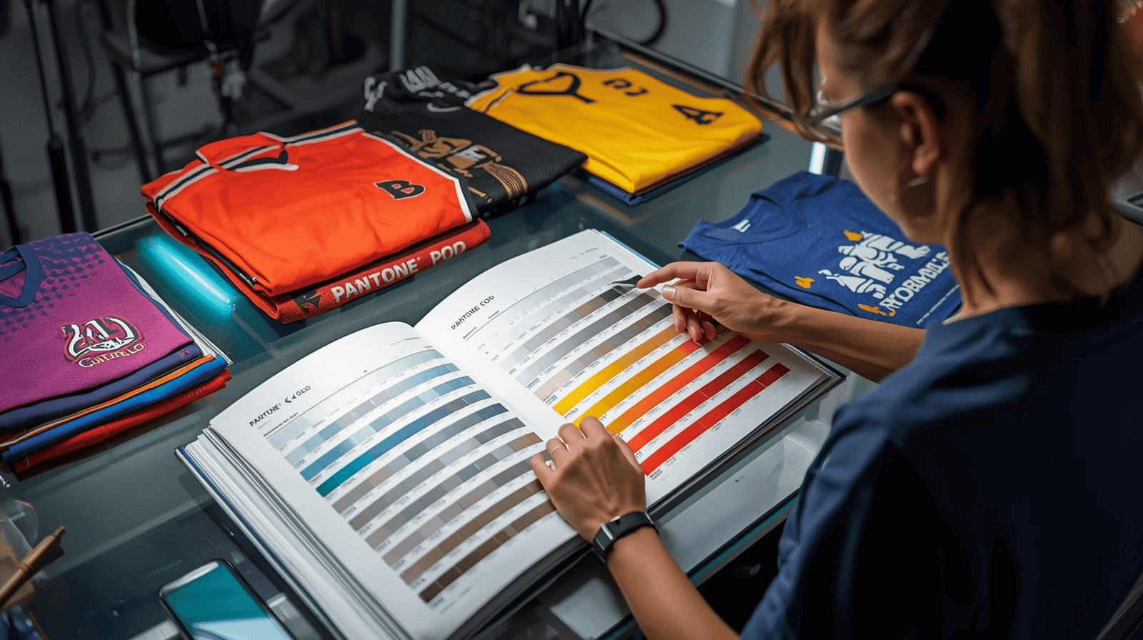
Pantone Color Matching for Sportswear Printing
Pantone is a standardized color matching system that assigns unique numerical codes to specific colors. Each Pantone color is created using a precise ink formula, allowing manufacturers worldwide to reproduce the same shade consistently.
In sportswear printing, Pantone is commonly used for:
-
Team identity colors
-
Sponsor and partner logos
-
Brand-critical design elements
-
Professional and league-level uniforms
Pantone’s biggest strength lies in consistency. When a brand specifies a Pantone code, manufacturers know exactly what color is expected. Detailed information about standardized color systems for textiles is available through official resources. Learn More!
Benefits of Pantone for Accurate Sportswear Colors
Pantone is often the preferred option for brands that prioritize precision and long-term consistency.
Key advantages include:
-
Exact color consistency across production runs
-
Clear communication between designers and manufacturers
-
Reduced risk of color disputes
-
Strong alignment with sponsor brand guidelines
Pantone is especially valuable for teams and organizations that reorder uniforms regularly. Manufacturers like Bushi Sports often recommend Pantone matching for professional teams, academies, and private-label brands focused on brand integrity.
You can explore Bushi Sports’ custom manufacturing capabilities through their sportswear manufacturing services, which highlight their expertise in bulk production and quality-driven processes.
Limitations of Pantone Color Matching
Despite its accuracy, Pantone is not always the most flexible or cost-effective option. Custom ink mixing can increase setup costs, and Pantone is not ideal for complex gradients or photographic designs.
Pantone works best for solid colors and logos rather than detailed, multi-color visuals. For design-heavy apparel, other color systems may offer better flexibility.
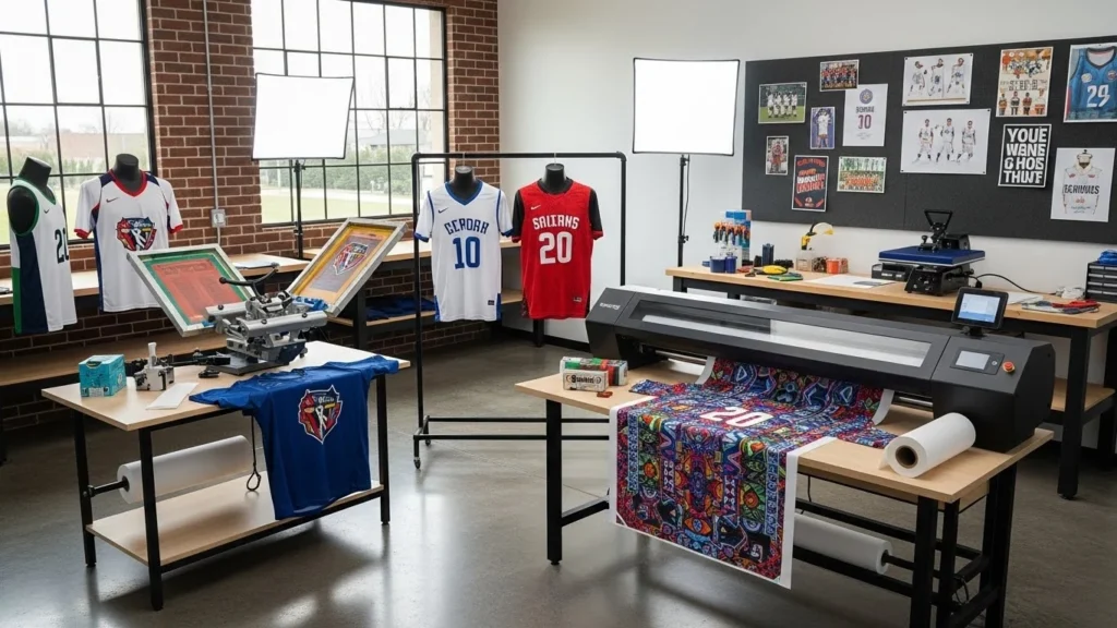
CMYK Printing for Sportswear Graphics
CMYK stands for Cyan, Magenta, Yellow, and Key Black. It is a four-color printing process that creates colors by layering dots of ink in different percentages. CMYK is widely used in digital printing and sublimation, both of which are common in modern sportswear production.
Unlike Pantone, CMYK does not use pre-mixed inks. Instead, colors are visually created through combinations of the four base colors. This allows greater design freedom, especially for complex artwork. Industry insights on textile printing technologies are frequently discussed by publications. Visit here!
CMYK Advantages in Sportswear Color Printing
CMYK offers flexibility and efficiency, making it ideal for modern sportswear designs.
Its main benefits include:
-
Ability to reproduce gradients and shading
-
Cost-effective setup for complex designs
-
Compatibility with sublimation printing
-
Faster production timelines
-
Greater creative freedom
CMYK is commonly used for all-over print jerseys, training wear, and fan apparel. Bushi Sports frequently applies CMYK sublimation techniques to produce lightweight, breathable sports kits with vibrant visuals.
You can learn more about sublimation-based apparel solutions through Bushi Sports custom jersey printing services, which are designed for vibrant, long-lasting performance wear.
Limitations of CMYK Color Matching
Because CMYK relies on visual interpretation rather than fixed formulas, exact color consistency can be challenging. Colors may appear slightly different depending on fabric color, lighting conditions, or production batches.
CMYK is less suitable for brands that require strict logo accuracy or sponsor compliance, especially for long-term reorders.
Pantone vs CMYK: Key Differences Explained
Understanding the difference between Pantone and CMYK helps brands choose the right approach for each project.
Pantone excels in consistency and accuracy, while CMYK offers flexibility and creative freedom. Many professional manufacturers use a hybrid approach—Pantone for logos and CMYK for background graphics.
For brands unsure which system to use, consulting a manufacturer early in the design process can prevent costly mistakes.
Choosing the Right Color System for Sportswear Printing
Selecting the right color system depends on your brand’s goals, budget, and production strategy.
Consider factors such as:
-
Importance of brand color accuracy
-
Design complexity
-
Printing method being used
-
Frequency of reorders
-
Budget and lead time
Brands working with experienced manufacturers like Bushi Sports benefit from guided color consultations that align design intent with production realities. You can explore the consultation and production workflow, which reflects a strong focus on quality, transparency, and long-term manufacturing partnerships, here.
How Manufacturers Control Color Accuracy in Sportswear
Professional sportswear manufacturers use multiple quality control steps to ensure color accuracy.
These include digital proofs, physical samples, fabric testing, and final inspections under controlled lighting. Maintaining color libraries and historical references also helps ensure consistency across repeat orders.
Manufacturers following global production standards often align their processes with internationally recognized textile quality guidelines to ensure consistency, safety, and reliability across production runs.
Common Color Matching Mistakes Brands Make
Many color issues stem from avoidable mistakes during the design and approval stage.
Common errors include using RGB files instead of print-ready formats, skipping physical samples, expecting CMYK to match Pantone exactly, and rushing approvals. These mistakes can lead to delays, reprints, and increased costs.
Why Bushi Sports Is Trusted for Color Accuracy
Bushi Sports understands that color matching in sportswear printing requires both technical expertise and clear communication. Their production process emphasizes accurate sampling, strict quality control, and transparent approvals.
By combining advanced printing technology with experienced manufacturing teams, Bushi Sports delivers consistent results across bulk orders. Brands sourcing export-ready sportswear benefit from their reliable color management and long-term production consistency.
You can contact Bushi Sports here, to discuss custom color requirements.
Final Thoughts on Color Matching in Sportswear Printing
Color matching in sportswear printing is a strategic decision that affects branding, quality, and customer satisfaction. Pantone and CMYK each serve different purposes, and understanding when to use each system helps brands avoid production issues.
By choosing the right color approach and partnering with an experienced manufacturer like Bushi Sports, brands can ensure consistent, professional sportswear that performs visually and functionally in every setting.